
Choosing Colors for Interior Decoration
The most important thing to consider when choosing color schemes is your own personality and preferences. Other questions you might ask yourself may include:
- What kind of activity is going to be done in this place?
- What kind of natural colors are there in this place?
- How much light is needed? Is this space light or dark?
- Do you want to have a warm or cold atmosphere here?
- Are you looking to create an inspiring and happy environment or a quiet and peaceful atmosphere?
- Do you want the room to look bigger or smaller than its actual size?
- What is the main shape of the room? Is it narrow and long or short and wide?
- Is the ceiling of the room high or short?
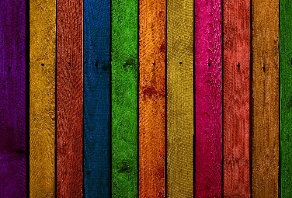
Imagine the color palette you need to paint a room with strong, bright, and motivating colors. Such features usually make the room look smaller. In this case, red, magenta, orange, and yellow will have the effect you want; these colors have the most significant possible effect in a room with a lot of activity.
On the other hand, you may want a calmer, more comfortable, and quieter environment. Green, cyan, dark purple, and blue colors provide such an atmosphere. You may want to use these colors in your bedroom or study. These colors increase the expansion of the mind and the breadth of thought.
Ceilings, walls, and floors
A crucial point to keep in mind when choosing colors is that colors usually look more concentrated in large spaces. It is better to choose a lighter color for the ceilings compared to other parts of the room. Doing so, helps maintain light, especially at night and in the absence of a natural light source.
Typical colors for ceilings are white, off-white, or yellow. However, if you want the ceiling to look shorter than its actual height, you can use a darker color compared to the rest of the room. In rooms with shorter ceilings, one can feel private and intimate, while very high ceilings may give us a sense of repression and cause Claustrophobia.
Common colors used for walls vary between light, medium, and white. Here, also, the reason for choosing such colors is to make the most of light. But if it is possible to let a lot of light into the room, they use darker shades instead. Adding light to this color can create an impressive and interesting atmosphere.
The floor colors in the rooms usually vary between medium and dark black. A practical point to consider when choosing the room floor’s color is that such colors are dark enough not to show dirt, stains, and wear. If you want to use lighter colors, Use them in parts of the building with the least traffic or the least amount of cleaning.
Living Room
Living room colors should be chosen based on the natural colors in the room. You should first pay attention to the color of the floor, fireplace, bricks, or stone works and avoid strong contrast between dark and light colors. Because contradictions attract attention, and because we usually dedicate such a room to reading, relaxing, listening to music, and talking, we do not want anything to disturb our senses.
It is better to choose curtains or shutters that have less contrast with the adjacent wall’s color. As a general rule, we recommend using shades darker than the walls for the color of the furniture, rugs, and upholstery. In this way, the original design of the living room blends with the colors, without any sharp contrast between them. You can add effective light shades to the room by choosing suitable colors for items such as vases, lampshades, and decorative plants.
Dining Room
Light and medium colors for the room walls provide a happy, warm, and friendly atmosphere. We suggest choosing colors that match the natural appearance of food. Since ashen colors such as green and yellow are reminiscent of disease and illness, it is better to avoid choosing such colors for the dining room. Contrasting colors can be used in small parts of the room, such as a tablecloth or napkin. In general, look for light shades of colors so that the colors of the food look good.
Bedroom
This room is a place to relax and unwind. It is recommended to choose soft and light colors for this room instead of contrasting and intense colors. Consider the climate of your place of residence. In cold countries, warm colors at the end of the color spectrum are good colors, and in areas with warmer climates, cold colors at the other end of the spectrum are invigorating colors.
Kids Room
For children under the age of thirteen, yellow, orange, and red are recommended at the end of the color spectrum to create a happy and bright environment. For older ages, lighter degrees of blue and green will be an excellent choice.